Your menu is more than a simple list of the items your restaurant has to offer. Using a menu management system to carefully plan your restaurant menu design can improve everything from your brand identity to your customer’s experience and your profits. In fact, good restaurant menu design can increase your profits by 10–15%.
In this article, we cover everything you need to know about menu design, including:
- The key ingredients of a well-designed food menu
- 5 online tools for on-brand menu design and logo design
- 51 examples of great restaurant menu design
Ingredients of Good Menu Design
Creative restaurant menu design is a recipe for success and, just like the menu itself, should always be changing. So, we’ve put together a list of ingredients to make sure you achieve the best possible results whenever you’re ready for a refresh. As you sit down to plan out your menu design, consider each of the following:
- Placement and categories: You’ll want to keep your cost and sales data close at hand as you lay out your items into four quadrants (listed below), strategically drawing attention to items that are highly profitable but may not be as popular.
- Profitable x Popular
- Profitable x Not popular
- Not profitable x Popular
- Not profitable x Not popular
- Limited choices: For each menu category, the magic number is 7. Decision fatigue is a real thing – especially when it comes to food. Too many options can be overwhelming and make people want to stick to what they know.
- The golden triangle: Speaking of strategy, make sure to include your high-margin items in the area known as the golden triangle. So where exactly is the golden triangle? According to restaurant consultant Aaron Allen, it starts at the center of the page and then works its way up to the top right corner and across to the top left.
- Color theory: Have you ever been driving along the expressway and looked around at a sea of red and yellow fast food chain signs? It’s hardly a coincidence. The psychological impact of color on our appetites dates way back to our early ancestors who deemed certains foods safe or unsafe to eat based on their color.
- High-margin items: Aside from highlighting these within the golden triangle, consider choosing fonts and colors that will attract the guest’s eye.
- Photos: When it comes to selecting food photos for your menu, follow these two rules religiously: less is more and quality over quantity.
- Menu modifiers: Without venturing into too much choice territory, consider the power of suggestion when it comes to including a couple of menu modifiers directly on your menu.
- Cross-selling: Whether it be as classy as a wine or beer pairing suggestion under each high-margin item, or as simple as pairing soups and salads under the same header, cross-selling is real.
- Accessibility: Have fun with your design, but make sure it remains readable and uncluttered. Bright fonts on a bright background, or menu descriptions being too small to read will have the same overwhelming effect as an overabundance of options.
- Platform: As you plan out your menu design, consider how it would work across your restaurant’s digital platforms, like your website and even social media. If it isn’t likely to translate, you’ll want to include a line item in your budget for digital menu design as well.
For a more in-depth dive into each of these ingredients, check out:
5 Online Tools for DIY Restaurant Menu Design
If paying a professional designer to refresh your food menu isn’t in your budget at the moment, there are a number of online services you can turn to for easy-to-customize restaurant menu design templates. Many of these programs can also help with logo design as well.
- MustHaveMenus: A one-stop shop for restaurant design and marketing, MustHaveMenus has the world’s largest collection of menu templates with over 7,000 designs to choose from. They make it easy to customize, print and share your menus online.
- Adobe Spark: Unlike many other Adobe products, you don’t need any design or programming skills to use Spark and build a beautiful menu in line with your brand identity.
- iMenu Pro: This program has only one focus and it’s menus, so the tools and graphics included are designed with restaurateurs in mind.
- Poster My Wall: Hundreds of templates, free downloads, and no design skills required!
- Flipsnack: This one is a little different because it focuses on digital menu design. If you’re looking to pretty-up your online menu, this tool is great!
Creating an eye-catching restaurant menu has never been easier thanks to these free restaurant menu templates.
51 Restaurant Menu Examples
We’ve put together a list of 51 menu card examples to serve as a bit of restaurant menu design inspiration, including the original image source and what exactly is so good about each one.
By the time you reach the end, you should be fully equipped to design a menu that elevates your brand, increases your profits, and ties into your brand identity in a way that stands out and gives your guests something to talk about in-person and on social media.
1. Quo Vadis – London, UK
The individual square boxes on this menu allow for highlighting high margin items and make the choices easy to navigate. Simple yet effective.
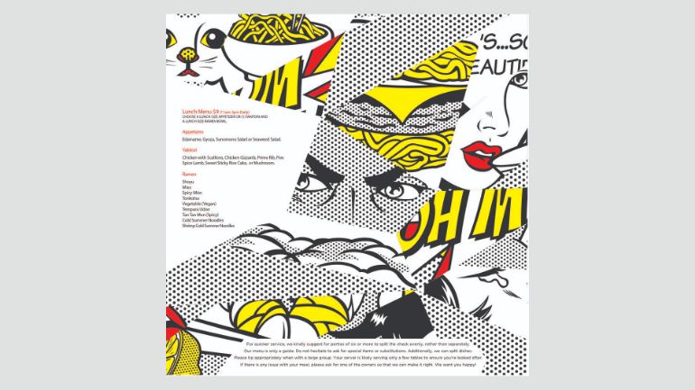
2. Michi Ramen – Austin, Texas
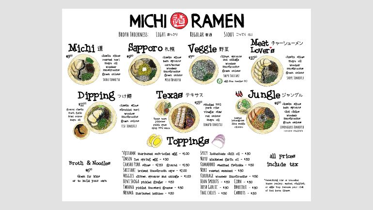
Simple illustrations on this menu make the dishes pop off the page.
3. Kittyhawk Cocktail Bar – Sydney, Australia

Concept-based menu design can help bring your backstory to life for customers.
4. The Sinclair – Cambridge, Massachusetts
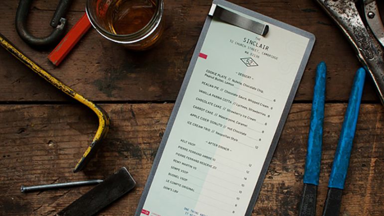
An image isn’t always required. Sometimes it’s all about being clean, elegant, and easy to navigate.
5. The Dead Rabbit – New York City, New York
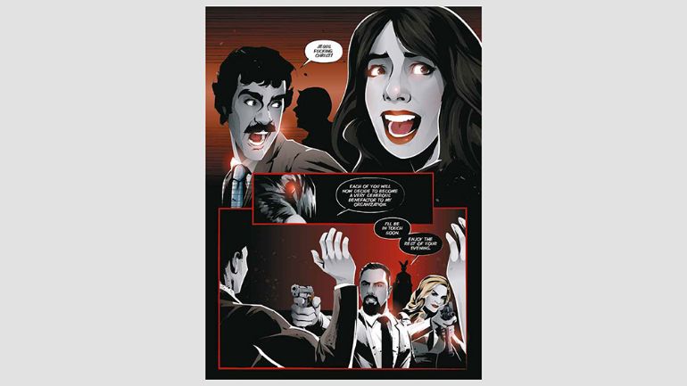
This one gets people talking. The cocktail menu reads like a graphic novel and tells the story behind each drink item listed.
6. Smoke & Duck Sauce – Atlanta, Georgia
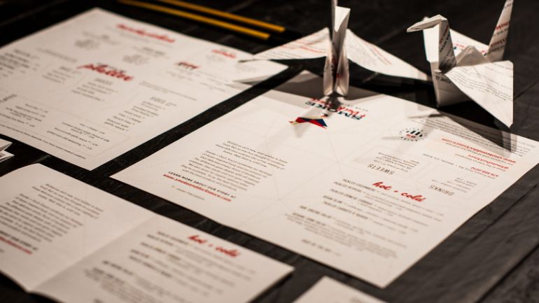
You know the types who fidget with their beer labels or tear up their coasters? They’ll love these menus designed to be folded up into little origami cranes.
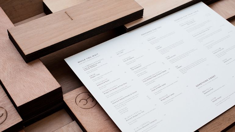
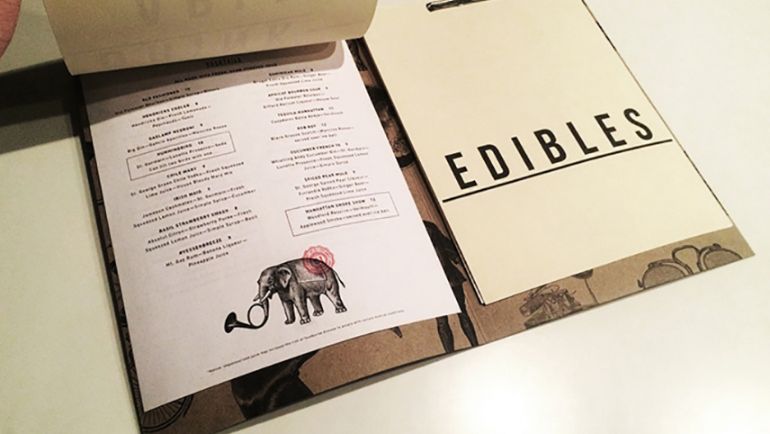
7. Eleven Madison Park – New York City, New York
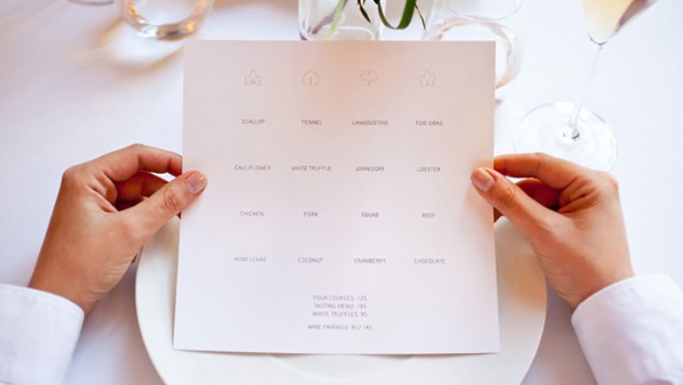
Under Consideration – Eleven Madison Park. Designed by Juliette Cezzar.
Here we’ve got minimal design, placed in a grid. When it comes to less is more, this menu design takes the cake.
8. The Fat Cow Japanese Steakhouse – Singapore
This menu was printed using wooden blocks made to resemble the branding of cows, which speaks to the restaurant’s Japanese style of “Wabi Sabi” beef.
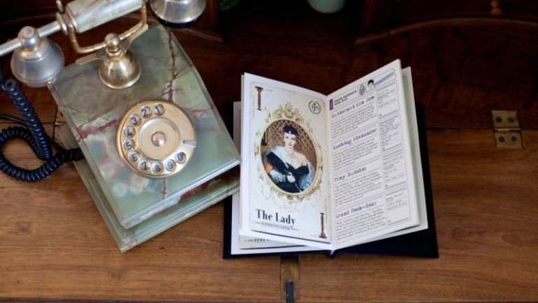
9. 13 Wives Cocktail Bar – Singapore
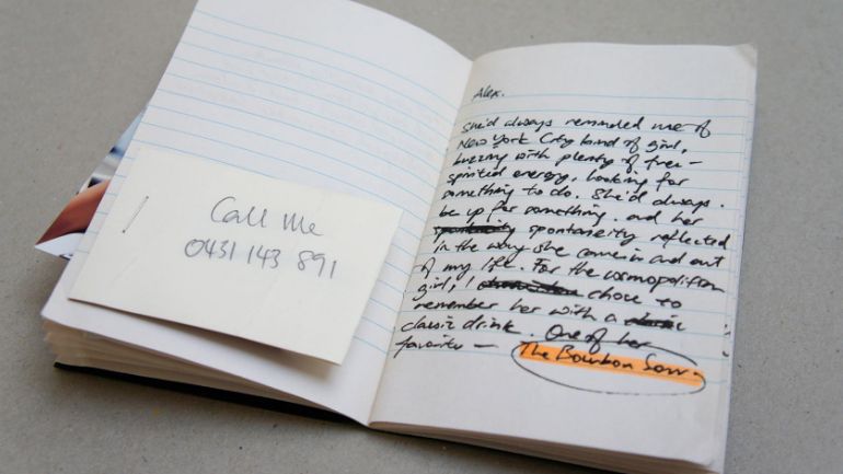
This cocktail menu is meant to feel like you’re reading the cocktail mixer’s personal little black book of ideas.
10. Arthur’s Nosh Bar – Montreal, Canada
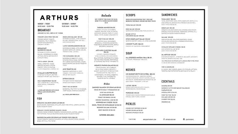
This food menu is simple, fits on one page, and uses an easy to read, black on white typeface.
11. Smith – Toronto, Canada
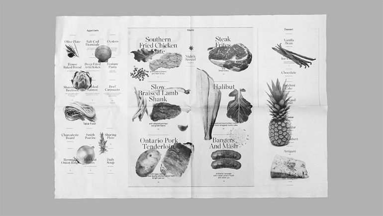
Made to look like a newspaper, this menu offers simple text and black and white images of the seasonally-changing food items on offer.
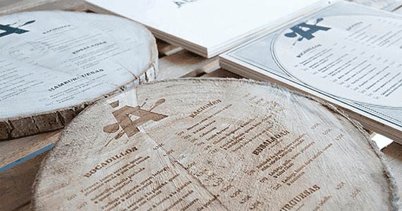
12. Zapiain – Astigarraga, Spain
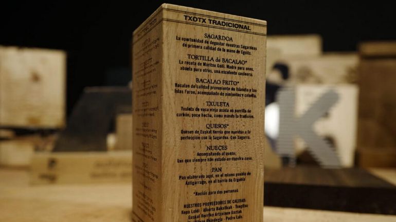
When your focus is on wine, your taco list can be short and to the point. This food menu, designed by Grabo Laser, was etched into a wood block which can easily be left on tables.
13. Ninebark – Napa Valley, California
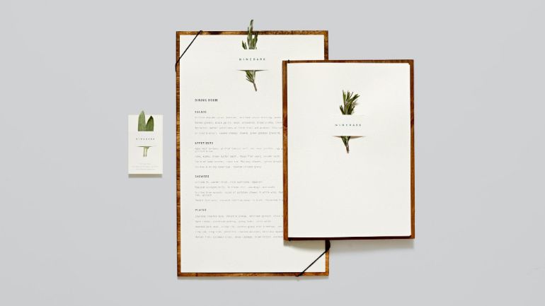
Fresh herbs are part of Ninebark’s brand, so they decided to feature them front and center on their menus.
14. Toko – Dubai, UAE
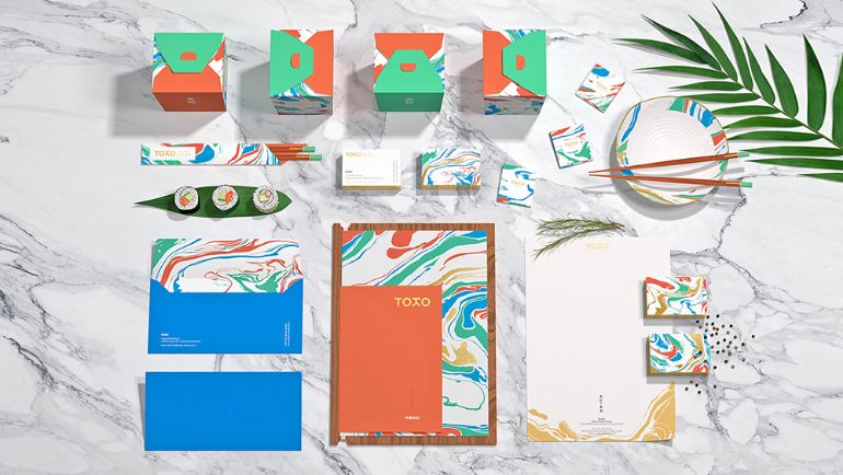
With all the minimalism and black and white type in the world these days, it’s refreshing that this Dubai-based Japanese restaurant brand went colorful with its unique marbled menu design.
15. Cafe Vera – Zaragoza, Spain
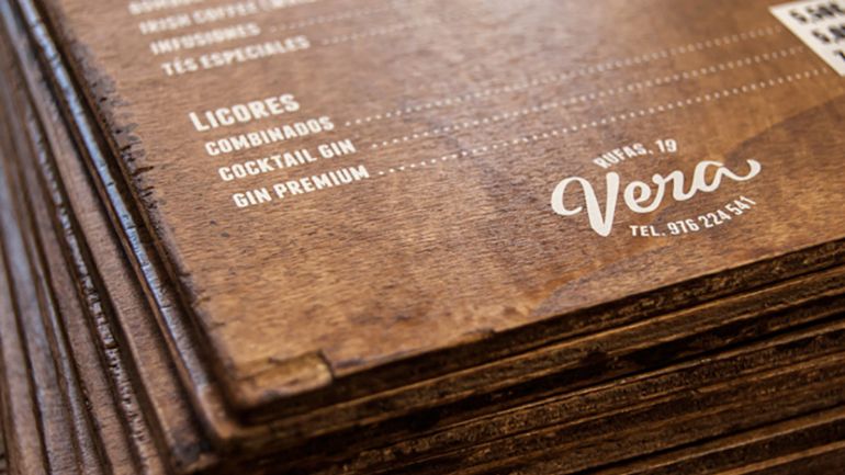
The tactile feeling of holding this solid wood plank menu in your hands immediately elevates the quality of the restaurant brand in your mind.
16. Cellarmaker Brewing Co. – San Francisco, California
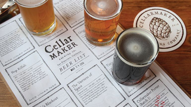
Not only is this vintage cellar inspired menu beautiful to look at, it serves as a bit of a bingo game for beer tastings.
17. Hula de Hawaii – Monterrey, Mexico
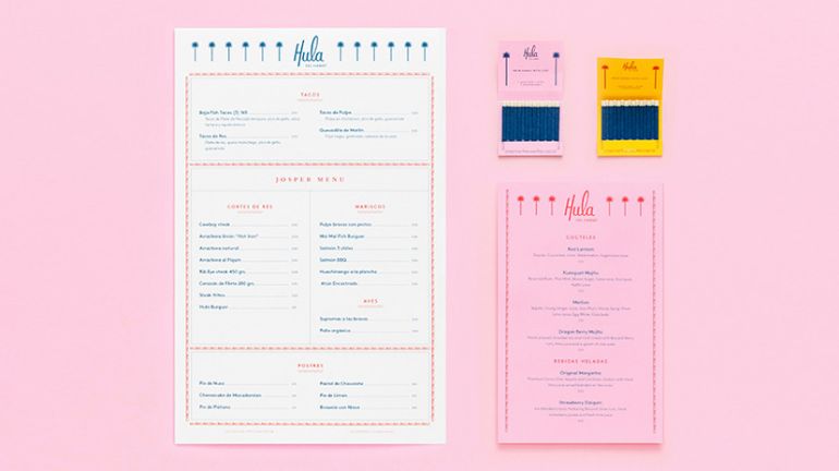
When your menu is inspired by all things Hawaii, it makes sense to design it with that in mind. There may even be some strategic color theory work happening behind the scenes.
18. Chick-a-Biddy, Atlanta, Georgia
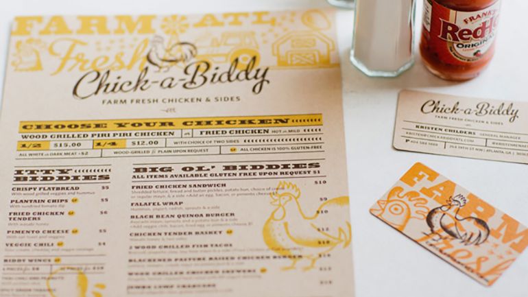
Yellow is the happiest color. No really. It’s been shown to trigger the release of serotonin in our brains, which in turn stimulates our appetites.
19. Fieldwork Brewing – Berkeley, California (multiple locations)
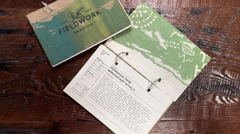
This craft brewery got a little crafty with their two-ring rolodex-style menu, which allows them to add and remove items as their taps change and rotate.
20. Nudo – Spokane, Washington
Make your pop art really pop by contrasting it against neat and tidy columns.
21. Admiral Maltings – Alameda, California
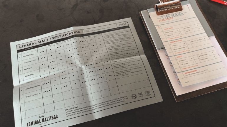
This California brewery’s menu doubles as a chart that lists the flavour profiles and ingredients of their beers.
22. One Night Only – Singapore
Themed around the idea of ephemera and the transient nature of old Americana road trips, this restaurant designed their menu to fit their vibe.
23. Fade Street Gastro Bar – Dublin, Ireland
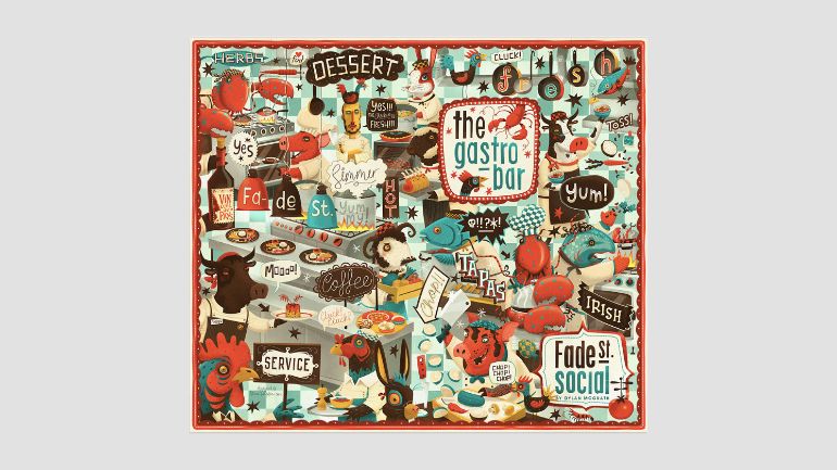
Keeping the actual menu clean and simple is good for your bottom line. But that doesn’t mean you can’t have some fun and get a little loud with your cover design.
24. Mr. Brown – Barcelona, Spain
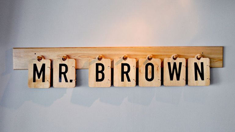
This restaurant menu was designed to be part of the decor when it’s not in use.
25. The Clifford Pier – Singapore
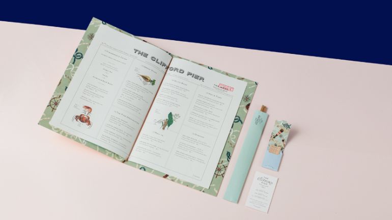
The designers behind this menu know the value of a strong first impression.
26. La Banane – Toronto, Canada
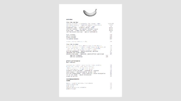
This single page, black and white design is so classy it hurts.
27. Parson’s Chicken & Fish – Chicago, Illinois
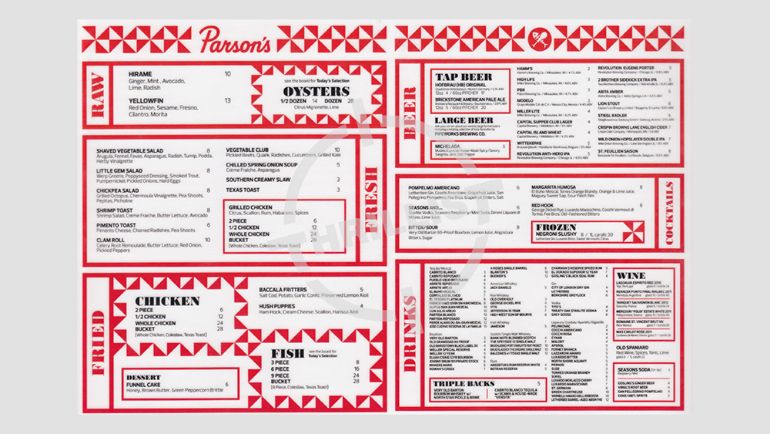
Has all that red and yellow made you hungry for some fried chicken yet?
28. Biderman’s Deli – Austin, Texas
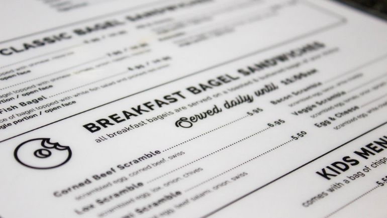
This deli serves up breakfast staples, so they’ve kept their menu as simple and straightforward as the contents.
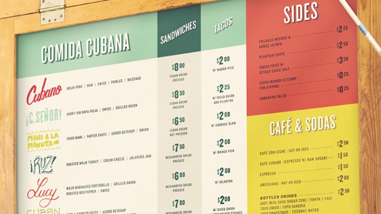
29. La Cubana – Toronto, Canada
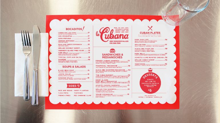
Limited choices, simple design, doubles as a placemat. This Toronto-based, Cuban-inspired joint is covering all their menu design bases.
30. Kuro Sushi – Poznań, Poland
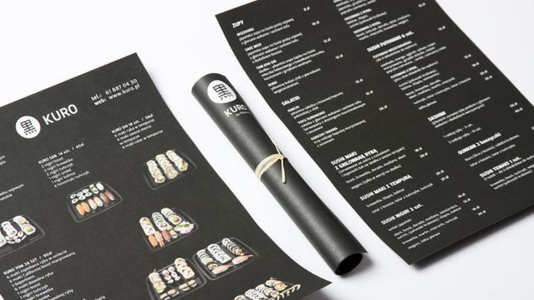
These food menus come rolled just like your maki!
31. Black Bean Deli – Orlando, Florida
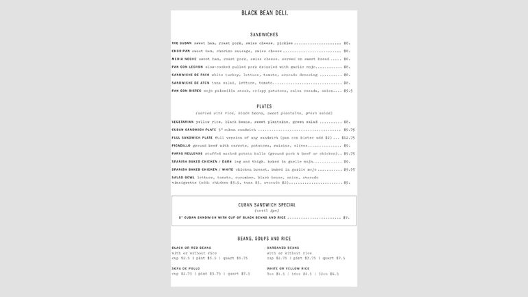
This Orlando-based Cuban joint keeps it easy to read on their behind-the-counter menu board.
32. Bar Raval – Toronto, Canada
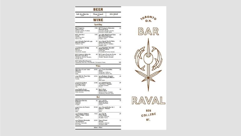
This Spanish tapas joint is known for its extensive wine list, so they’ve designed a menu that highlights this focus.
33. The Golden Girl Rum Club – Springfield, Missouri
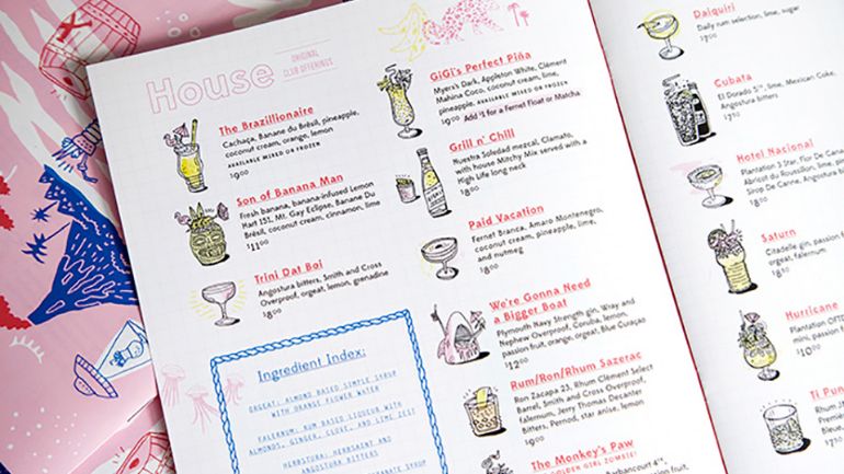
This menu is as fun and quirky as the cocktails within it, an individual image for each of The Golden Girl’s signature cocktails.
34. Hiding in Plain Sight – Amsterdam, Netherlands
When stashed on a bookshelf, this menu really lives up to the restaurant’s name.
35. The Noble Experiment – San Diego, California
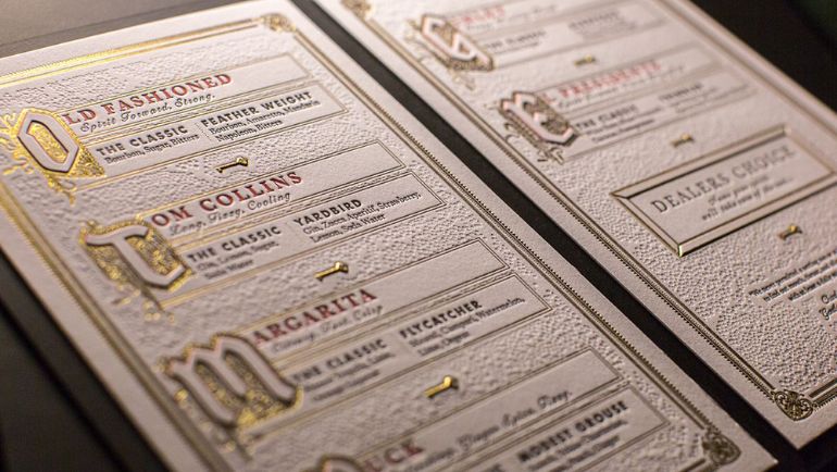
When it comes to noble experiments, these San Diegans got it right with a gold embossed textured menu.
36. Hero – Paris, France
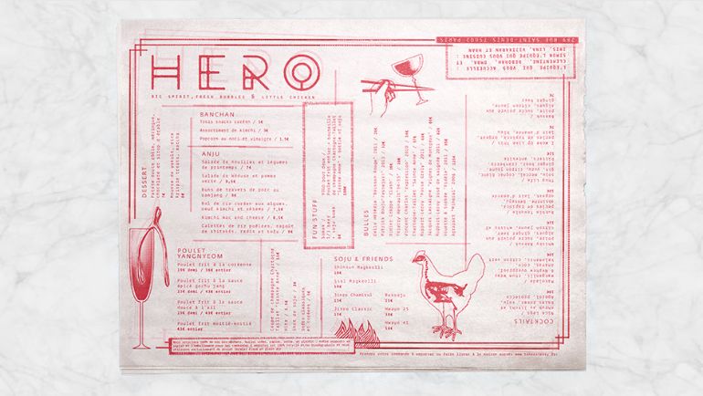
Clean and clear design allows this restaurant to get away with a more complicated layout.
37. Evo Vegetarian – Portland, Maine
Clean, clear, and classic menu design.
38. So9 – Melbourne, Australia
By breaking items down into different categories, you have the opportunity to suggest pairings with items in different boxes, which will boost your sales.
39. MataMata – Paris, France
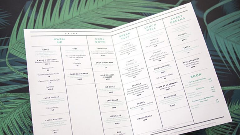
This grid makes the golden triangle easy to execute.
40. Gaslamp Social Provisions – Spokane, Washington
Simple illustrations that fit your restaurant’s theme can go a long way toward tying your brand identity together – especially when you carry that theme across your social media profiles as well.
41. Alamo – Zaragoza, Spain
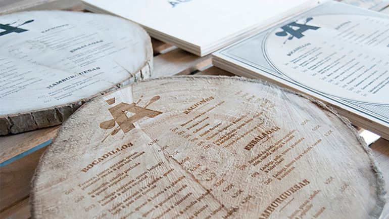
If you have the resources, make like a tree and leave a lasting impression on your guests with menus printed directly onto a slice of a tree trunk.
42. Catch and Release – L.A., California
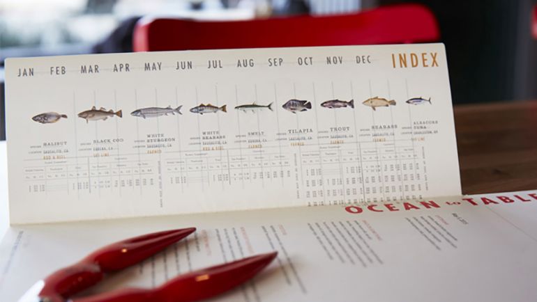
The Catch and Release menu highlights their specialty, with a fish index card to help guide guests.
43. Clerigo Tapas Bar – Porto, Portugal
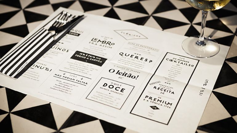
The golden triangle is being used to perfection here.
44. Savio Volpe – Vancouver, Canada
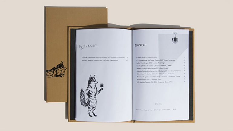
Some menus tell a story. This one illustrates the adventures of a clever fox, the namesake of the restaurant.
45. El Vez Burrito – New York City, New York
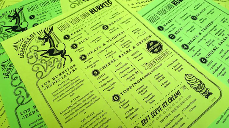
Burritos are fun and so are this restaurant brand’s logo design and menu.
46. Flamingo – Hegyeshalom, Hungary
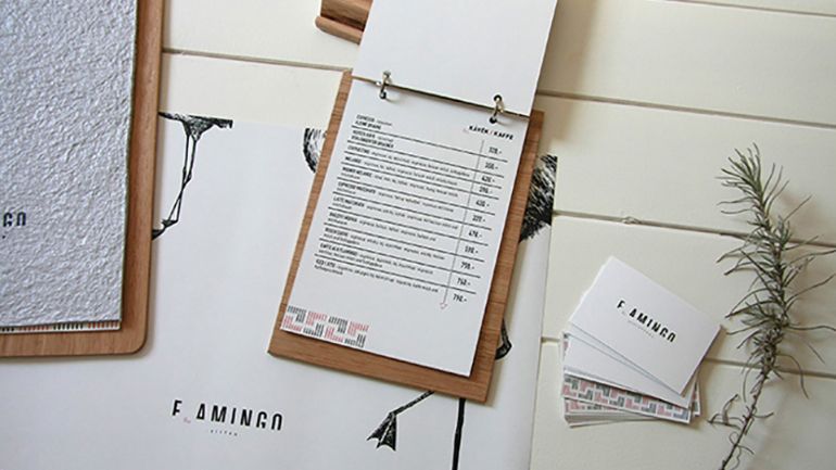
For menus that change regularly, include a permanent piece like this wood board with binder clips, and print off new menus when needed.
47. Real Sports Bar – Toronto, Canada
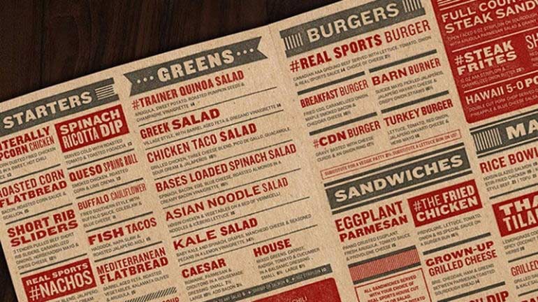
At first glance, it may seem like there are too many choices on this menu, but the strategically placed categories and carefully selected fonts and bolding make it easy for guests to navigate and pleasing to the eye.
48. Coldwater Creek – Wollongong, Australia
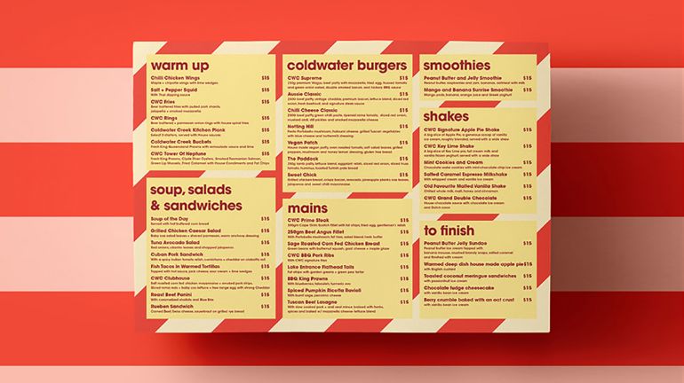
This menu design ticks off a lot of boxes: color theory, strategic categories, limited choices, and eye-popping design.
49. La Principal – Bogota, Colombia
Food photography done right.
50. C. Senor – Dallas, Texas
This list wouldn’t be complete without at least one example of a food truck menu. The simple design of this menu board uses the right mix of colour and eye-catching fonts.
51. Batinse – Quebec City, Canada
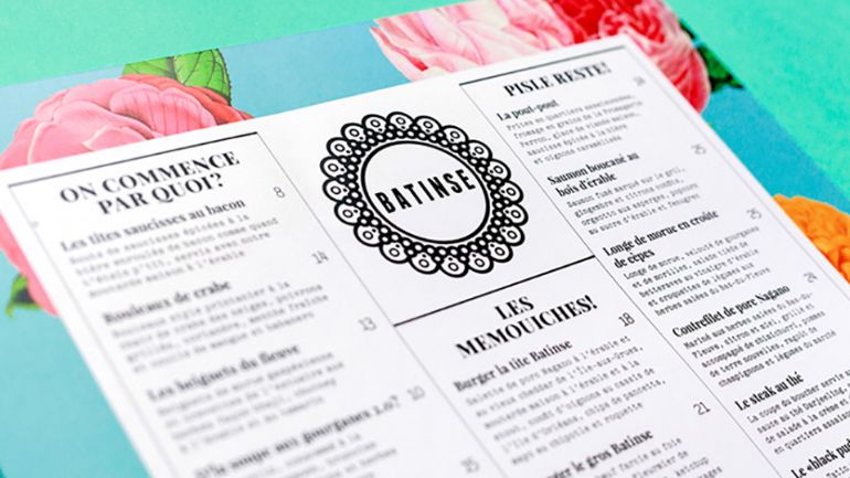
Another example of golden triangle perfection paired with excellent logo design.
Whether you’re just starting out or considering a rebrand, a well-thought-out restaurant menu design can go a long way to improving your bottom line. Working within the parameters listed at the top of this page will ensure your success – whether you’re jumping on a new design trend, or sticking with a tried and true classic look.
For more tips and tricks to achieving the ultimate restaurant menu design, check out:
Strategic menu design has been proven to grow profits by 15%.

Dana is the former Content Marketing Manager at TouchBistro, sharing tips for and stories of restaurateurs turning their passion into success. She loves homemade hot sauce, deep fried pickles and finding excuses to consume real maple syrup.
Download our free inventory template
Get our restaurateur newsletter: The Bistro Insider

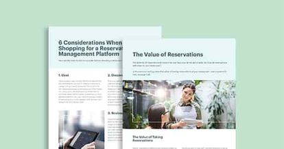
Your Complete Guide to Restaurant Reservations
Download Guide