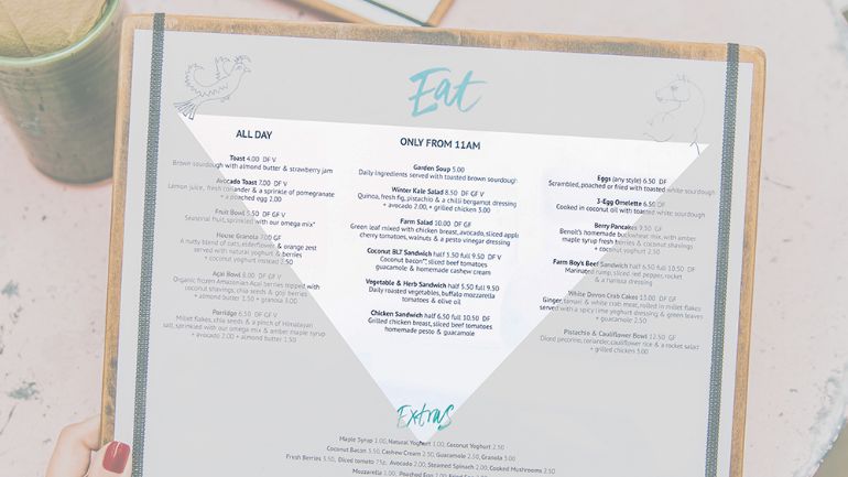
Whether your customers are looking up at a menu board or down at a centerfold, great restaurant menu design can feel like a true work of art. The right menu can ramp up a customer’s excitement – and hunger – to place their order at your restaurant.
But restaurant menu design is both an art and a science.
The most effective menus – the ones that subtly influence a customer’s decisions – aren’t a happy accident. Good menus are engineered, designed to influence buying by appearance, item placement, and upselling potential.
In fact, menu engineering is proven to increase profits by 10–15% – so it’s safe to say that thoughtful restaurant menu design is worth the investment.
But what informs an effective menu design strategy? How do you figure out the what, how, and where that will get you that return on investment?
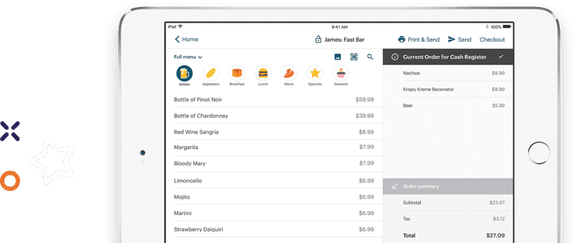
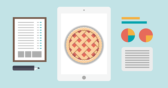
Your point of sale (POS) is the perfect place to start.
Since a modern POS system acts as the central hub of your restaurant – not just processing but collecting information from every sale – it’s a gold mine of information.
To help you dig to the bottom and tap into the good stuff, we’re highlighting six ways to mine your POS data for restaurant menu design that increases profits.
1. Food cost report
A modern POS food cost report should show you:
- food sales and costs by day and by menu item
- how much each item has contributed to sales
- how much each item costs to produce
- all of the above information broken down by specific times – like a certain week, season, or event
Here’s an example of what a food cost report should look like:
Pad Thai x 20
Sales: $280.00
Cost: $70.00 (25.0%)
Chicken Curry x 16
Sales: $207.20
Cost: $48.00 (23.2%)
Eggplant Pasta x 2
Sales: $24.00
Cost: $4.00 (16.7%)
Popularity vs. profitability: The golden triangle
By studying your food cost reports, you’ll be able to see some trends. Does the pad Thai consistently outsell the chicken curry? But is the eggplant pasta way more cost effective?
When you’re paying close attention to items that are popular (highest sales) and profitable (lowest food cost percentage), you’ll uncover the key to good menu design: what belongs in the golden triangle of your menu.
The golden triangle is the area of your menu that customers read first. Menu items that are both popular and profitable are your first choices for this section, but profitable yet unpopular items deserve a spot here, too, so you can increase their popularity – and your bottom line.
Extra love for menu modifiers – and upselling
Beyond full dishes, your food cost report will also provide insight on all those little extras. Extra cheese on a burger. Substitute regular milk for almond milk. Side of bacon, anyone?
Modifiers that come for an extra charge are a great way to increase the average check size without a lot of cost on your end. Your food cost report can show you the popularity and profitability of these items, which you can use to decide which modifiers to include on your menu and where.
Want to drive up the profitability of a popular dish? Highlight what your guests can add to customize the dish. Upselling – done the right way – looks more like great customer service when you’re offering modifiers as a way to personalize menu items.
Less (choice) is more per menu category
Did your printed food cost report reach all the way to the floor? Your report may have just revealed that you have too many menu items.
More choice isn’t always better. Research shows that too much choice can slow down and even block the decision-making process. Guests take longer to order and are more likely to default to their favorite items – items that may not be on your most profitable list.
The magic number is 7. If your food cost report lists a lot more than 7 in each menu category, it’s time to think about paring down and including fewer items in your menu design.
2. Alcohol Cost Report
Your alcohol cost report gives you the same data as your food cost report but for items on your alcohol menu instead of food. You should be able to see breakdown of your alcohol sales and costs by day and by menu item, including what’s been sold, how it contributes to overall sales, and the total cost to produce each beverage.
Look at all the same elements as with your food cost report: popularity vs. profitability, upsell items, and total number of items.
Give your alcohol the golden triangle treatment
If you have a separate bar menu, use your knowledge of the most profitable items to decide what should be placed in the golden triangle.
If alcohol is listed on your main menu, brainstorm creative restaurant menu design ideas to draw attention to the real money-makers in this menu category. Beyond the beverage list itself, this could also include your most profitable upsells like premium liquors for mixed drinks or an option for a double.
A case for the lunch-specific booze menu
Your alcohol cost report may also reveal low alcohol sales during specific times of day, such as during lunch.
If you don’t have one already, consider creating a separate lunch menu that highlights smaller portions of alcohol (because not everyone’s game for a boozy lunch midweek). Options for a half pint or half bottle of wine will increase your alcohol profit over lunch, since some customers may only be comfortable with just a taste of the “good stuff” before running to their 2:00 pm meeting.
3. Top Menu Item Report
A top menu item report from your POS reveals your best and worst sellers within a designated time frame (daily, weekly, yearly, etc.) and menu category (entree, appetizer, dessert). If you’re planning a menu design refresh, this report offers invaluable data on your customers’ buying habits – it’s the results from your menu’s popularity contest.
Stamp of approval – menu icons that sell
We’ve seen some cool restaurant menu designs that highlight populars items with an icon beside each dish (and a legend below) or even a separate menu category – sometimes referred to as customer picks or fan favorites. Use your top menu item report to show you how to direct customers to items that have the golden stamp of approval.
Today’s special becomes tomorrow’s staple
Knowing what’s popular can help you decide whether to give temporary items a more permanent home on your menu.
Let’s say your summer dessert special was a strawberry shortcake, which consistently earned the top spot throughout the warm months. You might want to make it a year-round staple.
If your menu changes more seasonally, your year-over-year reports can help you decide which items you should bring back when the ingredients are in season.
Knowing how many items will remain consistent versus which ones will be in flux can also help you choose a menu design that’s easily updated – check out #19 and #46 on our list of 51 Best Restaurant Menu Designs and Why They’re Great.
Sharing the spotlight with your bottom five
The bottom five of your top menu items report can show you which items might need some spotlight to boost their performance. Just because an item isn’t selling well doesn’t mean customers don’t enjoy it – it’s possible they’ve just never noticed it on your menu.
If a bottom five item has a high profit margin, you may want to place it within your golden triangle. But if the item still doesn’t perform – it’s time to consider removing it from your menu.
4. Heat Map
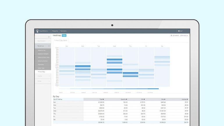
Your POS heat map will show you which times of the day are producing the most (and least) sales. While your heat map can help you determine labor needs, it can also help with restaurant menu design by highlighting your slowest times – so you can craft a specials menu (such as happy hour).
Rather than printing a separate menu, include a specials section on your regular menu to advertise the incentive for coming in during slower times. Your menu design should call attention to this section – perhaps with different font, color, or placement – with special items and/or prices not available during regular dining hours.
5. Menu Categories
Your menu categories do more than just help your servers navigate the POS menu to place orders. Looking at sales reports by menu category (entree, appetizer, cocktails, draught beer, etc.) can help inform your menu design in a few different ways.
Riding on coattails
Identify the most popular items in each category, then use that data to cross-sell (creating a combo or a food pairing), tying profitable items to your popular ones. If you apply these groupings within your menu design, it becomes easier for customers to make decisions – all the information they need to order a meal is in one location.
Theory of relative price points
Menu categories and restaurant menu pricing strategies can also help identify your most expensive item in each category. Strategically placing an expensive bottle of wine close to a slightly less pricey but more profitable wine will drive customers to order the more profitable items – it makes them feel better about the splurge, knowing how much they could have spent on a bottle, glass, or pint.
Clutter control
It all comes back to a numbers game. Do you have too many menu categories? Like we mentioned above, too much choice can hinder the decision-making process and clutter your menu design. Take a close look at your menu categories with both food and alcohol. Can any of them be combined? Fewer categories can provide a better (and faster) ordering experience.
6. Sales by Area
A sales by area report breaks down the sales revenue based on the different areas of your restaurant. Depending on the size and style of your restaurant, your report could include quite a few areas: dining room, patio, bar, and takeout areas would all have separate sales numbers in this report.
When you’re creating a new menu design, sales by area data can help you tailor each menu specifically for its trends. The overall design aesthetic of the dining room and takeout menus stays the same, but the placement and inclusion of items may be different. Lobster, for example, may be popular in your dining room but doesn’t get a lot of takers in the bar.
The profitability of certain items may change from area to area as well, so you should cross-reference the sales by area data with the food or alcohol cost. Fajitas, for example, could have a much higher takeout cost versus patio cost since they require several containers to keep the dish from getting soggy in transport. You can leave items with a lower profit margin off the takeout menu completely.
Also for takeout, if you’re creating your own online menu, consider using your sales by area data to choose your most popular items and put these right at the top of the page (not everyone will scroll to the bottom or click to expand menu categories). Having these winning dishes in plain sight could help you drive more sales.
Your POS should be your first stop to gain insight for restaurant menu design and to inform your menu pricing strategies. Once you’ve collected this data, you can make informed decisions about design and end up with a menu that looks great but sells even better.

Dana is the former Content Marketing Manager at TouchBistro, sharing tips for and stories of restaurateurs turning their passion into success. She loves homemade hot sauce, deep fried pickles and finding excuses to consume real maple syrup.
Download our free inventory template
The right POS should help you increase sales
The right POS should help you increase sales.