At first, creating your restaurant’s menu may seem simple: list the dishes, add a price and leave the decision making to the customer. In reality, a menu can be a strategic and persuasive tool. But, it’s up to you to curate your restaurant menu design, menu layout & menu size to guide dining decisions and maximize profitability.
Now that you’ve learned how to price your menu items, we’ll outline the steps you need to take to design it.
In order to ensure your menu is aesthetically pleasing, balanced, profit-driven and functional, all at the same time, this section will cover:
- Tools for restaurant menu design
- Various types of menu layouts and menu sizes
- Tips for designing your menu using layout, color, background, and price formatting
- Requirements for nutritional information
- Masters at restaurant menu design
The first thing you need to consider when creating your restaurant menu design is that your menu should be easy to update. This flexibility is critical for seasonal changes, especially when you’re ready to add new summer menu ideas. Although, changes will occur naturally as kitchen procedures and operations evolve from theory into reality. With this in mind, design your menu to have a few options.
You can:
Hire a Graphic Designer
A graphic designer specializing in menu design works with you to craft a menu that embodies your concept and menu items. Always hire a designer who specializes in restaurant menu design and understands the psychology of menu development, also known as menu engineering. (We’ll speak more to this in the next article, Menu Engineering: Increasing Profits.)
Pros:
Graphic designers create materials with your brand in mind. They have the technical skillset to use programs in order to meet both your aesthetic and practical needs. They create a restaurant menu that is unique to your concept and will collaborate with you until you’re satisfied. Most of the time, they’ll provide you with digital and print formats, and some may even handle the printing process for you.
Cons:
You will have to rehire the graphic designer whenever you need to change menu items.
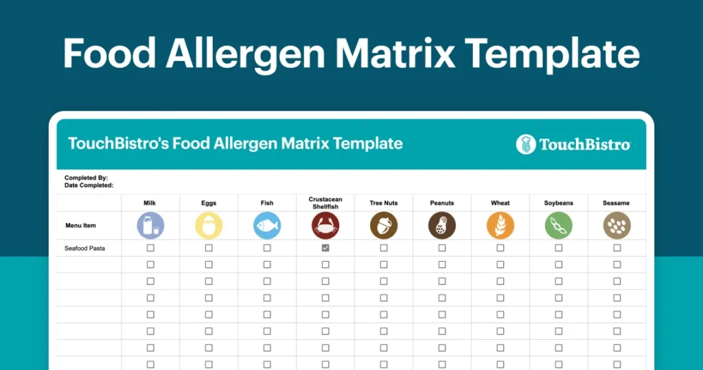
Download this customizable template for you and your staff to use to protect the health and safety of your guests with food allergies.
Design Agency vs. Freelance Designer
You have the choice of hiring a design agency or hiring a freelance designer. Agencies would be the choice for restaurant chains that have a big budget for design projects with a very broad scope. Agencies are more expensive due to their overhead and expenses. For your first restaurant, a freelance designer is the more cost effective option. Freelance designers come at a lower price point and give you the same attention and expertise as an agency, without the large price tag.
Pricing:
Freelance designers charge using the following pricing models:
- Contract: A set price-based on a quote given at the beginning of the project.
- Hourly rate: An hourly price based on the time it takes them to create the menu and made adjustments based on your feedback.
- Value-based pricing: Price based on the individual designer’s ability to add value. Their value promise could be fast service or experience in increasing sales (i.e. menu engineering), not just aesthetics.
How to hire one:
Your restaurant consultant likely has a few designers that they can recommend. You can hire a freelancer the old fashion way through a job posting site or by asking a restaurant whose menu you admire for a reference. Alternatively, you can find a designer through either of these graphic design associations:
The Professional Association of Design (US)
Association of Registered Graphic Designers (Canada)
Menu Design Software
The most cost-effective option; menu design software allows you to quickly create new menus by customizing professionally-designed templates. The design collections provide a range of options and the editing process is designed to be intuitive, so anyone can create a professional-looking menu.
Pros:
- A cost effective approach that lets you stay in control of your brand.
- You don’t have to deal with the hassle of any back and forth with a third-party designer.
You can make updates and reprint on your own time. - You don’t need design skills. Layouts, matching fonts and colors, item sections are all designed for you.
- Some, like MustHaveMenus, go beyond menus to include in-store marketing and social media templates that you can use for your restaurant.
Cons:
- You will have to manually type in all of your menu items.
- It may take some time, and trial and error, to find the perfect template.
Here are the two best menu design software options for restaurants:
- $12.95 per month
- Restaurant-focused
- The largest collection of menu templates on the web
- Intuitive editing software designed for menu creation
- Restaurant-savvy customer service team
- Additional marketing materials like business cards, flyers, and social media posts
- Professional Printing
- $15 per month
- Restaurant-focused
- Large collection of menu templates
- No real-time customer service
- No professional printing
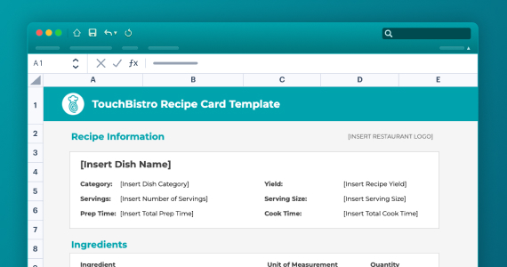
Use this template to standardize your dishes, train staff faster, and reduce food waste – all while keeping food costs in check.
Best Practices for Restaurant Menu Design
Now that you know your options for creating a menu, let’s take a look at all the things you’ll need to consider when it comes to restaurant menu design.
Formats
Depending on your restaurant concept and the number of menu items, there are four basic types of formats you can choose from.
Single page:
The entire menu is placed on a single page, either vertical or horizontal. This format is commonly used by fine-dining restaurants, prix fixe menus, and farm-to-table restaurants that constantly change their menus based on seasonal ingredients.
Pros:
- Diners will make decisions faster. If horizontal, you can easily place menu items according to the diner’s eye movement patterns.
Cons:
- Diners are less likely to order many dishes and the format doesn’t accommodate a wide variety of menu items.
Two-panel, single fold:
This is the most common type of restaurant menu. Like a book, the menu opens so that all menu items are visible across two pages.
Pros:
- Easy for diners to read. Optimal format for you to strategically place profit generating dishes.
Cons:
- If you have a lot of menu items, this format might not be big enough.
Three-panel, two-fold:
For larger menus, the three-panel, two-fold menus allow restaurants to showcase a wide-variety of dishes. These are often found at pubs, casual, and family style restaurants.
Pros:
- Accommodates a wide variety of menu items.
Cons:
- Not as easy to read as single page or two page menus.
Download this customizable template for you and your staff to use to protect the health and safety of your guests with food allergies.
Many panel booklet:
For very large menus, this booklet accommodates a wide-variety of dishes. This menu format is most commonly found in family-style restaurants and accommodates shared-plates quite well.
Pros:
- Accommodates an extensive amount of menu items.
Cons:
- More difficult to engineer for profits. More items are harder for diners to remember. They make the decision making process more confusing and produce more operational strain.
For a more in-depth analysis of laying out your design for profitability, read about menu engineering.
Length
Start small. To borrow a concept from product theory, your first menu should be a Minimum Viable Product (MVP). MVP dictates that your product should start out with the minimum features needed to satisfy customers and provide feedback for future development. When applied to menu development, this methodology dictates that you should start with a small amount of menu items. Once you start selling and acquiring customer feedback, you can then make additions.
That said, the length of your menu will vary depending on your restaurant’s concept. Most menus are built to accommodate the standard paper sizes of 8.5” x 11”. If your menu exceeds 12” x 18”, consider having separate menus for wine, dessert, and kids in order to keep the size manageable. You don’t want to overwhelm your guests. To feature dishes, use table tents, menu boards, or chalk boards.
Number of items
Menu engineers suggest that each menu category should have no more than seven items: seven appetizers, seven mains, seven desserts, seven cocktails, etc. While old menu strategies tried to include something for everyone, new menu best practices follow a less-is-more philosophy. The selection process for diners is easier when they have less to choose from. Bonus: fewer menu items is easier on food costs, kitchen prep and makes for faster service.
Ways to lay out your menu
By order:
- Arrange items in the sequence diners would order them in. Start with appetizers, then mains and conclude with desserts.
By category:
- Categorize menus items by logical groups. In addition to appetizers, mains and desserts, consider adding additional categories for salads, pasta, seafood, and other specialty grouped items like tacos, wings, etc. In other words, any type of dish you serve in a variety of ways.
By column:
- Use columns and rows to structure your content. Use columns to order items in a single category, like appetizers. Use rows to separate each menu item. At a glance, this makes the menu easy to understand. In other words, don’t haphazardly throw menu items down on a page. Make it easy for the reader to logically identify categories on your menu.
By where the eye falls:
- When diners read your menu, their eye naturally gravitates to certain areas of the page, typically the top of the page. Consider these areas prime real-estate. They should be home to the menu items that yield the most profit and the highest margin.
Each menu format has different areas that draw diners’ attention. Find out what they are in our section on menu engineering.
For items that you’d like to draw attention to, consider using a call-out box. This practice is also known as framing. By framing a single item or a category of items, you catch a reader’s attention. To align with menu engineering best practices, place the dishes you want to be best known for or dishes with high profit margins in these boxes, like pasta or rice-bowls. While call-out boxes are an effective way to direct a diner’s eye, use them sparingly. The more call-out boxes you have, the less effective they will be.
pro tip: use of color, large or unique font, photos, illustrations, and call-out boxes are all referred to as “eye magnets.” eye magnets are graphic techniques that redirect the diner’s eye from their natural reading pattern to a particular part of the menu. use eye magnets sparingly in order to direct the diner’s eye, without overwhelming it.
Branding your menu
The following elements of a restaurant menu design have a dual function. They describe your menu items while reinforcing your restaurant’s brand. If your brand is tongue-in-cheek, then item titles, descriptions and look and feel should be too. Likewise, if your brand is elegant, then those same elements should be more formal in nature. In other words, ‘rump roast’ may be appropriate for some menu item names, when ‘pork butt’ might actually work well on others.
Naming
The name you choose for each dish should direct the diner’s attention to a particular aspect of that dish, whether it’s an ingredient, a texture, a feeling, or a flavor. The name sets up the experience of that dish in the mind of diners. You don’t have to stick to one style of description. Experiment with different naming strategies and keep in mind the larger design format.
Try naming dishes based on:
- Primary ingredient – e.g. Beef tenderloin, Swordfish, Duck Confit.
- Sensory or flavor-driven descriptors – e.g. mouth-watering, sweet and sour, savoury, sweet.
- Cultural and geographic terms – e.g. Cajun-fried, Thai-style, Southern, Nordic, Italian, Country-style
- Nostalgic terms – e.g. Home-made, comfort, traditional, classic, Grandma’s/Grandpa’s, Mom’s/Dad’s
- Cooking descriptors – e.g. Braised, slow-cooked, dry-aged, char-grilled, smoked, house-cut, BBQ
Description
Keep menu item descriptions to the point. The main function of the description is to let the diner know what’s in the dish, how it was prepared, and what it comes with. If you choose to add to your description, be brief. Limit it to any additional information about noteable differentiators, craftsmanship, and any of the sensory/cultural/nostalgic descriptors described above.
pro tip: by applying more appealing description tactics to your high profit dishes and more basic descriptions to lower profit dishes, you increase the probability that high profit dishes will be sold.
Create descriptions based on:
- Ingredients: List the ingredients in each dish. Be specific. Instead of “pasta”, say “linguini”. Instead of “rice”, say “wild rice”.
- Describe cooking style: Use short cooking descriptors to describe each ingredient, like lightly seasoned, sauteed, marinated or hand-pressed.
- Evocative language: As we mentioned in the naming section, use descriptors that are: sensory, flavor driven, cultural, geographic, nostalgic, or cooking process related.
- Differentiators: Identify best sellers and fan favorites in the description. This can also be expressed with a symbol next to the item name.
- Craftsmanship: Describe the whole cooking process. For example: Slow-roasted pork roast, braised to perfection then topped with a tangy mushroom sauce.
Use this template to standardize your dishes, train staff faster, and reduce food waste – all while keeping food costs in check.
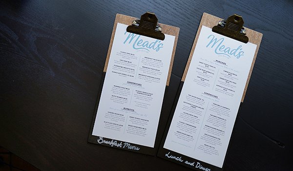
Photos
Like call-out boxes, photos are an eye-magnet. In general, most high-end restaurants don’t use photos. Many diners and chefs alike associate photos with low-end or cheap restaurants, although they are sometimes used by chains and family-style restaurants. The danger with photos is that they’re subjective. Not all photos appeal to everyone. For most restaurants, it’s better to have your guests see the dish as it’s carried by, accompanied by the smell and ambiance than to clutter your menu with an image.
If you do use photos, use professional photos and do so sparingly by limiting the photos to one per panel.
In place of photos, consider using illustrations. They still serve the purpose of drawing a diner’s eye to a particular part of your menu, but they’re easier to adapt to your brand and more universally appealing.
Color
Again, colors are an eye magnet which direct a diner’s eye to particular sections or dishes on your menu. They also help readers group visual information.
For example: If you use the color red to list menu categories, when the reader sees red, they will understand that section is apart of a specific menu category. If you use blue call-out boxes and blue font for specialty dishes, when the reader sees blue, they will understand that this is separate (or important) from the rest of the menu.
Color and brand: Color reinforces the brand and mood of your restaurant. If you use color, consult your target market on colors that appeal to them and stick to your theme. For example: If you’re a lively Cuban restaurant, you can get away with using poppy colors like red, orange and yellow. This wouldn’t be the same for a fine-dining French restaurant, which should stick to a more neutral color palette.
Color theory: Based on evolution, humans have been conditioned to associate certain colors with consumption. Certain colors can actually stimulate appetite. Red and yellow are said to increase appetite because they’re associated with “safe” foods. Grey, brown, black, and blue are known to decrease appetite because they’re associated with poisons.
Adjust the shade of color: An easy way to draw attention without adding too many colors into the mix is to adjust the shade of a single color. This is also known as dot-matrix screening. For example, if you choose to write your menu items in bold black, you could adjust the descriptions to grey so that the black titles stand out prominently.
Where to use color:
- Menu item titles
- Borders
- Call-out boxes
- Graphics
- Specialty items
pro tip: avoid tiring out your diners’ eyes. for background, text, images, illustrations, avoid high contrast and saturated color combinations.
Fonts
Another design tactic, another eye magnet. Similarly to color, use font to embody the theme and concept of your restaurant. Use font strategically to attract your customer’s eye to particular dishes and sections of your menu.
Font and readability: Make sure that your font is easy to read. The smallest size you should use is 20-30 points. Always print a prototype of your menu and have a few friends or colleagues read it to ensure that the font size, type, and color are legible.
Font and brand: A cursive or italic font gives your menu a more formal look and requires your diner’s attention to read. On the other hand, some print-based fonts are more playful and quick to read. Depending on your brand and concept, you may choose one experience over the other.
Font for digital vs. print: Serif fonts (fonts with small lines at the edges of letters) are print-friendly. They’re created so that readers can easily distinguish the letters. Sans serif fonts (fonts without these small lines) are web friendly. When creating the final outputs of your menu, consider using different font for print than digital. Here’s an example:
Font and consistency: Font is most effective as an eye magnet when you limit your menu to three fonts. Any more and the reader’s eye does not know where to rest.
While you can play with fonts between descriptions, menu items, categories, call-out boxes and titles, make sure that within each category, the font is the same (i.e. all descriptions use the same font and all categories use the same font. But descriptions and categories can be different fonts).
Bold and italics: Similarly to color, use bold and italic fonts to help readers group visual information (e.g. all descriptions are written in italics) and direct them to important dishes (e.g. bolded menu items indicate specialty items).
PRO TIP: Create a text hierarchy using a combination of color, font and font size. Categories should be the largest, followed in size by items and then again by descriptions and prices. Each level of the hierarchy should have the same color, font, and size characteristics (i.e. all categories are blue, size 70, and Pacifico. Whereas all descriptions are grey, size 30, and Calibri.
Use this template to standardize your dishes, train staff faster, and reduce food waste – all while keeping food costs in check.
Background
Do: keep it simple.
The general ethos behind your menu background is to keep it simple. You don’t want to distract diners with a background that takes away from your menu items. Nor do you want a background that makes the descriptions hard to read. Keep the contrast neutral and the colors muted.
Do: use negative space.
Negative space (or whitespace) allows the diners’ eyes to take a break and process the information on your menu. Call out boxes and other eye magnets are more effective when they stand out against a blank canvas. In other words…
Don’t: overcrowd your menu.
Give your items and descriptions a chance to stand on their own two feet. Less text allows the reader to understand and digest what they’re reading.
Pricing
There are a few ways you can list prices on your menu. You can choose to price menu items using any one of the following formats:
- $9.99
- $10
- 10
- Ten
Ninety-nine cents theory: This pricing strategy runs on the idea that when you keep a price at $X.99 cents instead of rounding to the next dollar, readers associate the price with the less expensive number. In the mind of the consumer, the item is priced less than it actually is and thus, they are more willing to buy. We should note: less and less restaurants are abiding by this old standard. Instead, many are choosing to round up to the next dollar.
The $ theory: A 2009 study from Cornell University found that when restaurants remove the dollar sign from their menu price, customers spent significantly more than menus with dollar signs or those that had written out the price.
Download this customizable template for you and your staff to use to protect the health and safety of your guests with food allergies.
Menu Nutrition Information
Both the US and some Canadian provinces are introducing calorie labeling on restaurant menus. These laws were created in order to cut down on obesity and promote restaurant transparency. All in all, these laws contribute to the development of a consumer understanding of healthy calorie limits.
Does it apply to me?
Both US and Ontario rules stipulate that any restaurant that belongs to a chain or enterprises with 20+ restaurants has to add calorie counts to their menu and a calorie disclaimer.
If your restaurant does not belong to a chain or restaurant corporation with 20+ restaurants, then you don’t have to comply with calorie labelling rules (for now.) However, you can opt-in to include calories. For restaurants that have health and nutrition central to their brand, you could opt-in into the calorie labelling rule as a marketing initiative.
Labeling Rules
US
In short, The Menu Labeling Rule, part of the Affordable Care Act, requires restaurants and other food establishments to disclose the caloric content of each menu item. Restaurants or retail establishments with 20 or more locations must comply with the new rule by May 7, 2018.
US Disclaimer:
On regular food items and menus: “2,000 calories a day is used for general nutrition advice, but calorie needs vary.”
On food items directed at children:”1,200 to 1,400 calories a day is used for general nutrition advice for children ages 4 to 8 years and 1,400 to 2,000 calories a day for children ages 9 to 13 years, but calorie needs vary.”
Canada (Ontario)
In Canada, individual provinces determine calorie labeling rules. In 2017, Ontario became the first Canadian province to require calorie counts on menus. This rule is a part of the Healthy Menu Choices Act, which came into effect January 1st 2017. The Act requires any chain restaurant with more than twenty locations to add calorie information to menus.
Ontario Disclaimer:
On regular food items and menus: “The average adult requires approximately 2,000 to 2,400 calories per day. However, individual calorie needs may vary.”
Food items directed at children: “Adults and youth (ages 13 and older) need an average of 2,000 calories a day, and children (ages 4 to 12) need an average of 1,500 calories a day. However, individual needs vary.”
Formatting
Both US and Canadian acts require that calorie information also be included for every dish. The calories must be included on the menu using the following formatting:
US:
Calories must appear:
- next to the name or the price of the associated standard menu item in a type size no smaller than that of the name or the price of the associated standard menu item (whichever is smaller)
- in the same color used for the name of the associated menu item
- with the same background used for the associated menu item
Ontario:
Calories must appears:
- in the same size and lettering as the price on the menu (including menu boards).
Download this customizable template for you and your staff to use to protect the health and safety of your guests with food allergies.
Conclusion
If your food is the soul of your restaurant, the restaurant menu design is the heart. Like many things in the industry, menu design is both an art and a science. A menu that is at once functional, aesthetically pleasing, and in line with your brand is your best lure for profits. Now that we’ve covered the basic art of restaurant menu design, it’s time to get into the science of leveraging your menu to boost your sales.

Silvia is the former Digital Marketing Manager for TouchBistro. During her time with TouchBistro, she managed and coordinated content for the RestoHub blog.
Get our restaurateur newsletter: The Bistro Insider

Your Complete Guide to Restaurant Reservations
Download Guide